I simplified the code to make it shorter and make the 3d card flip on hover. The card flips on the Y axis from the front face to the backface this is what it looks like:
This is what I changed for the filp effect:
- the front face wasn’t rotated on th Y axis on hover
- the hover effect was launched when the
.backdiv was hovered. This can create flickering as that div is rotating and “disapears” at mid rotation. It’s better to launch the animation when the static parent is hovered. - the first parent isn’t really usefull so I removed it
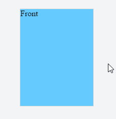
Here is an example of a simple CSS only flipping card the flip animation is launched on hover :
.card {
  position: relative;
  width: 9rem; height: 12rem;
  perspective: 500px;
  margin:5vh auto;
}
.front, .back {
  position: absolute;
  width: 100%; height: 100%;
  transition: transform 1s;
  backface-visibility: hidden;
  transform-style: preserve-3d;
}
.front {
  background-color: #66ccff;
}
.back {
  background-color: #dd8800;
  transform: rotateY(180deg);
}
.card:hover .front{ transform: rotateY(180deg); }
.card:hover .back { transform: rotateY(360deg); }
<div class="card">
<div class="front"><span>Front</span></div>
<div class="back"><span>Back</span></div>
</div>Note that you will need to add vendor prefixes depending on the browsers you want to support. See canIuse for 3d transforms and transitions.