I would use multiple linear-gradient and a complex animation (by animating size/position of each one) to obtain the final result. If you get the trick you can easily adjust the different values to obtain any animation you want.
.draw {
  padding: 20px 50px;
  outline:none;
  border: none;
  box-shadow: none;
  background-image:
  linear-gradient(#f45e61, #f45e61),
  linear-gradient(#f45e61, #f45e61),
  linear-gradient(#f45e61, #f45e61),
  linear-gradient(#f45e61, #f45e61),

  linear-gradient(#60daaa, #60daaa),
  linear-gradient(#60daaa, #60daaa),
  linear-gradient(#60daaa, #60daaa),
  linear-gradient(#60daaa, #60daaa);

  background-position: 0 0, 0 0, 0 100%, 0 100%,
                       0 0, 0 0, 0 100%, 100% 0;
  background-size: 3px 0%, 0% 3px, 0% 3px, 3px 0%,
                   3px 100%, 100% 3px, 100% 3px,3px 100%;
  background-color:transparent;
  background-repeat:no-repeat;
  transition:0.2s linear;
}

.draw:hover {
  background-position: 0 100%, 0 0, 0 100%, 100% 0,
                       0 0, 0 0, 0 100%, 100% 0;
  background-size: 3px 0%, 100% 3px, 0% 3px,3px 0%,
                   3px 100%, 100% 3px, 100% 3px,3px 100%;
  animation: animate 1.4s linear infinite 0.2s;
}

@keyframes animate {
  0% {
  background-position: 0 100%, 0 0, 0 100%, 100% 0,
                       0 0, 0 0, 0 100%, 100% 0;
  background-size: 3px 0%, 100% 3px, 0% 3px,3px 0%,
                   3px 100%, 100% 3px, 100% 3px,3px 100%;
  }
  40% {
  background-position: 0 100%, 100% 0, 100% 100%, 100% 0,
                       0 0, 0 0, 0 100%, 100% 0;
  background-size: 3px 0%, 100% 3px, 0% 3px,3px 100%,
                   3px 100%, 100% 3px, 100% 3px,3px 100%;
  }
  60% {
  background-position: 0 100%, 100% 0, 100% 100%, 100% 100%,
                       0 0, 0 0, 0 100%, 100% 0;
  background-size: 3px 0%, 0% 3px, 100% 3px,3px 100%,
                   3px 100%, 100% 3px, 100% 3px,3px 100%;
  }
  70% {
  background-position: 0 100%, 100% 0, 0% 100%, 100% 100%,
                       0 0, 0 0, 0 100%, 100% 0;
  background-size: 3px 100%, 0% 3px, 100% 3px,3px 0%,
                   3px 100%, 100% 3px, 100% 3px,3px 100%;
  }
  80% {
  background-position: 0% 0%, 0% 0, 0% 100%, 100% 100%,
                       0 0, 0 0, 0 100%, 100% 0;
  background-size: 3px 100%, 0% 3px, 0% 3px,3px 0%,
                   3px 100%, 100% 3px, 100% 3px,3px 100%;
  }
  100% {
  background-position: 0% 0%, 0 0, 0 100%, 100% 100%,
                       0 0, 0 0, 0 100%, 100% 0;
  background-size: 3px 0%, 100% 3px, 0% 3px,3px 0%,
                   3px 100%, 100% 3px, 100% 3px,3px 100%;
  }
}
<button class="draw">Draw</button>How does it work?
The structure: We have 8 linear-gradient. 4 will simply create the initial border and won’t move (they are placed at the bottom layer) and 4 will be used to draw the line that will create our animation above the initial border (they are placed at the top layer).
The order is important as within background properties we will have 8 values each one for each gradient. You will notice the 3px value that will simply specify the width or height of each gradient (similar to the border-width) and it won’t change during the animation.
The animation: I will adjust position/size of each gradient to create the animation. it’s divided into 2 parts: a small transition and a big animation. The transition is simply used to create the initial state of the animation that’s why the duration used for the transition is the same as the delay of the animation.
-
The first step is to animate the top border from left to right. To do this the gradient should be positioned at
(0,0) [top,left]with a size of0% 3px [width height]. Then I simply change the size to100% 3pxand I will get the needed animation (the 3px as described before won’t change).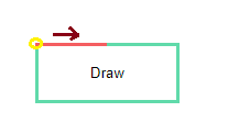
-
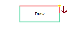
Now to animate the second border we do the same. We need a gradient positioned at
(100%,0) [top,right]with a size of3px 0% [width height]that we animate to3px 100%:
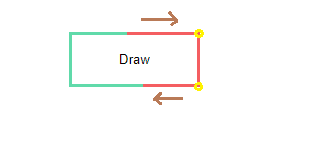
- Now since we have two borders we need to animate the third one AND hide the first one. I won’t detail the third border as it’s similar to the above ones so let’s see how to hide the top one. The first intuitive idea is to simply set its size back to
0% 3pxbut this will simply create the inverse animation and thus we will have a right to left animation which is bad. The trick here is to adjust the position of the gradient to make it(100%,0) [top,right]instead of(0,0)as both positions are equivalent when the gradient is 100% size (so we do this at the previous step when animating the second one). Now, we can put back the size to0% 3pxand we will have a left to right animation:
- We continue the same logic until we get back to the initial state and by specifying
infinitein the animation property we will have the needed effect.
So the main Idea is to have a gradient with the size equal to 0% that we animate to full size (100%) in a given direction then we change its position (this won’t have any effect on full size) and then animate back its size to 0. We mix this with the 4 gradients we have.
UPDATE
To avoid the confusing with all these gradient here is an update where I used a pseudo element for the static border thus we keep only 4 gradients for the animation:
.draw {
  position:relative;
  padding: 20px 50px;
  outline:none;
  border: none;
  box-shadow: none;
  background-image:
  linear-gradient(#f45e61, #f45e61),
  linear-gradient(#f45e61, #f45e61),
  linear-gradient(#f45e61, #f45e61),
  linear-gradient(#f45e61, #f45e61);

  background-position: 0 0, 0 0, 0 100%, 0 100%;
  background-size: 3px 0%, 0% 3px, 0% 3px, 3px 0%;
  background-color:transparent;
  background-repeat:no-repeat;
  transition:0.2s linear;
}
.draw:before {
  content:"";
  position:absolute;
  z-index:-1;
  top:0;
  right:0;
  left:0;
  bottom:0;
  border:3px solid #60daaa;
}

.draw:hover {
  background-position: 0 100%, 0 0, 0 100%, 100% 0;
  background-size: 3px 0%, 100% 3px, 0% 3px,3px 0%;
  animation: animate 1.4s linear infinite 0.2s;
}

@keyframes animate {
  0% {
  background-position: 0 100%, 0 0, 0 100%, 100% 0;
  background-size: 3px 0%, 100% 3px, 0% 3px,3px 0%;
  }
  40% {
  background-position: 0 100%, 100% 0, 100% 100%, 100% 0;
  background-size: 3px 0%, 100% 3px, 0% 3px,3px 100%;
  }
  60% {
  background-position: 0 100%, 100% 0, 100% 100%, 100% 100%;
  background-size: 3px 0%, 0% 3px, 100% 3px,3px 100%
  }
  70% {
  background-position: 0 100%, 100% 0, 0% 100%, 100% 100%;
  background-size: 3px 100%, 0% 3px, 100% 3px,3px 0%;
  }
  80% {
  background-position: 0% 0%, 0% 0, 0% 100%, 100% 100%;
  background-size: 3px 100%, 0% 3px, 0% 3px,3px 0%;
  }
  100% {
  background-position: 0% 0%, 0 0, 0 100%, 100% 100%;
  background-size: 3px 0%, 100% 3px, 0% 3px,3px 0%
  }
}
<button class="draw">Draw</button>