This answer has two main sections:
- Understanding how alignment works in CSS Grid.
- Six methods for centering in CSS Grid.
If you’re only interested in the solutions, skip the first section.
The Structure and Scope of Grid layout
To fully understand how centering works in a grid container, it’s important to first understand the structure and scope of grid layout.
The HTML structure of a grid container has three levels:
- the container
- the item
- the content
Each of these levels is independent from the others, in terms of applying grid properties.
The scope of a grid container is limited to a parent-child relationship.
This means that a grid container is always the parent and a grid item is always the child. Grid properties work only within this relationship.
Descendants of a grid container beyond the children are not part of grid layout and will not accept grid properties. (At least not until the subgrid feature has been implemented, which will allow descendants of grid items to respect the lines of the primary container.)
Here’s an example of the structure and scope concepts described above.
Imagine a tic-tac-toe-like grid.
article {
  display: inline-grid;
  grid-template-rows: 100px 100px 100px;
  grid-template-columns: 100px 100px 100px;
  grid-gap: 3px;
}
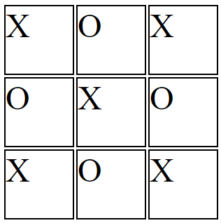
You want the X’s and O’s centered in each cell.
So you apply the centering at the container level:
article {
  display: inline-grid;
  grid-template-rows: 100px 100px 100px;
  grid-template-columns: 100px 100px 100px;
  grid-gap: 3px;
  justify-items: center;
}
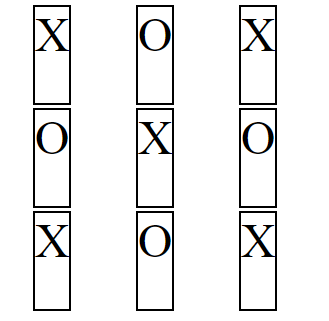
But because of the structure and scope of grid layout, justify-items on the container centers the grid items, not the content (at least not directly).
article {
  display: inline-grid;
  grid-template-rows: 100px 100px 100px;
  grid-template-columns: 100px 100px 100px;
  grid-gap: 3px;
  justify-items: center;
}

section {
    border: 2px solid black;
    font-size: 3em;
}
<article>
<section>X</section>
<section>O</section>
<section>X</section>
<section>O</section>
<section>X</section>
<section>O</section>
<section>X</section>
<section>O</section>
<section>X</section>
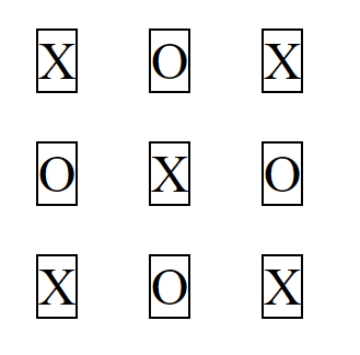
</article>Same problem with align-items: The content may be centered as a by-product, but you’ve lost the layout design.
article {
  display: inline-grid;
  grid-template-rows: 100px 100px 100px;
  grid-template-columns: 100px 100px 100px;
  grid-gap: 3px;
  justify-items: center;
  align-items: center;
}
article {
  display: inline-grid;
  grid-template-rows: 100px 100px 100px;
  grid-template-columns: 100px 100px 100px;
  grid-gap: 3px;
  justify-items: center;
  align-items: center;
}

section {
    border: 2px solid black;
    font-size: 3em;
}
<article>
<section>X</section>
<section>O</section>
<section>X</section>
<section>O</section>
<section>X</section>
<section>O</section>
<section>X</section>
<section>O</section>
<section>X</section>
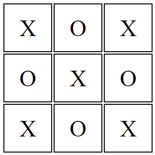
</article>To center the content you need to take a different approach. Referring again to the structure and scope of grid layout, you need to treat the grid item as the parent and the content as the child.
article {
  display: inline-grid;
  grid-template-rows: 100px 100px 100px;
  grid-template-columns: 100px 100px 100px;
  grid-gap: 3px;
}

section {
  display: flex;
  justify-content: center;
  align-items: center;
  border: 2px solid black;
  font-size: 3em;
}
article {
  display: inline-grid;
  grid-template-rows: 100px 100px 100px;
  grid-template-columns: 100px 100px 100px;
  grid-gap: 3px;
}

section {
  display: flex;
  justify-content: center;
  align-items: center;
  border: 2px solid black;
  font-size: 3em;
}
<article>
<section>X</section>
<section>O</section>
<section>X</section>
<section>O</section>
<section>X</section>
<section>O</section>
<section>X</section>
<section>O</section>
<section>X</section>
</article>jsFiddle demo
Six Methods for Centering in CSS Grid
There are multiple methods for centering grid items and their content.
Here’s a basic 2×2 grid:
grid-container {
  display: grid;
  grid-template-columns: 1fr 1fr;
  grid-auto-rows: 75px;
  grid-gap: 10px;
}


/* can ignore styles below; decorative only */
grid-container {
  background-color: lightyellow;
  border: 1px solid #bbb;
  padding: 10px;
}
grid-item {
  background-color: lightgreen;
  border: 1px solid #ccc;
}
<grid-container>
<grid-item>this text should be centered</grid-item>
<grid-item>this text should be centered</grid-item>
<grid-item><img src="http://i.imgur.com/60PVLis.png" width="50" height="50" alt=""></grid-item>
<grid-item><img src="http://i.imgur.com/60PVLis.png" width="50" height="50" alt=""></grid-item>
</grid-container>Flexbox
For a simple and easy way to center the content of grid items use flexbox.
More specifically, make the grid item into a flex container.
There is no conflict, spec violation or other problem with this method. It’s clean and valid.
grid-item {
  display: flex;
  align-items: center;
  justify-content: center;
}
grid-container {
  display: grid;
  grid-template-columns: 1fr 1fr;
  grid-auto-rows: 75px;
  grid-gap: 10px;
}

grid-item {
  display: flex;            /* new */
  align-items: center;      /* new */
  justify-content: center;  /* new */
}

/* can ignore styles below; decorative only */
grid-container {
  background-color: lightyellow;
  border: 1px solid #bbb;
  padding: 10px;
}
grid-item {
  background-color: lightgreen;
  border: 1px solid #ccc;
}
<grid-container>
<grid-item>this text should be centered</grid-item>
<grid-item>this text should be centered</grid-item>
<grid-item><img src="http://i.imgur.com/60PVLis.png" width="50" height="50" alt=""></grid-item>
<grid-item><img src="http://i.imgur.com/60PVLis.png" width="50" height="50" alt=""></grid-item>
</grid-container>See this post for a complete explanation:
- How to Center Elements Vertically and Horizontally in Flexbox
Grid Layout
In the same way that a flex item can also be a flex container, a grid item can also be a grid container. This solution is similar to the flexbox solution above, except centering is done with grid, not flex, properties.
grid-container {
  display: grid;
  grid-template-columns: 1fr 1fr;
  grid-auto-rows: 75px;
  grid-gap: 10px;
}

grid-item {
  display: grid;            /* new */
  align-items: center;      /* new */
  justify-items: center;    /* new */
}

/* can ignore styles below; decorative only */
grid-container {
  background-color: lightyellow;
  border: 1px solid #bbb;
  padding: 10px;
}
grid-item {
  background-color: lightgreen;
  border: 1px solid #ccc;
}
<grid-container>
<grid-item>this text should be centered</grid-item>
<grid-item>this text should be centered</grid-item>
<grid-item><img src="http://i.imgur.com/60PVLis.png" width="50" height="50" alt=""></grid-item>
<grid-item><img src="http://i.imgur.com/60PVLis.png" width="50" height="50" alt=""></grid-item>
</grid-container>auto margins
Use margin: auto to vertically and horizontally center grid items.
grid-item {
  margin: auto;
}
grid-container {
  display: grid;
  grid-template-columns: 1fr 1fr;
  grid-auto-rows: 75px;
  grid-gap: 10px;
}

grid-item {
  margin: auto;
}

/* can ignore styles below; decorative only */
grid-container {
  background-color: lightyellow;
  border: 1px solid #bbb;
  padding: 10px;
}
grid-item {
  background-color: lightgreen;
  border: 1px solid #ccc;
}
<grid-container>
<grid-item>this text should be centered</grid-item>
<grid-item>this text should be centered</grid-item>
<grid-item><img src="http://i.imgur.com/60PVLis.png" width="50" height="50" alt=""></grid-item>
<grid-item><img src="http://i.imgur.com/60PVLis.png" width="50" height="50" alt=""></grid-item>
</grid-container>To center the content of grid items you need to make the item into a grid (or flex) container, wrap anonymous items in their own elements (since they cannot be directly targeted by CSS), and apply the margins to the new elements.
grid-item {
  display: flex;
}

span, img {
  margin: auto;
}
grid-container {
  display: grid;
  grid-template-columns: 1fr 1fr;
  grid-auto-rows: 75px;
  grid-gap: 10px;
}

grid-item {
  display: flex;
}

span, img {
  margin: auto;
}

/* can ignore styles below; decorative only */
grid-container {
  background-color: lightyellow;
  border: 1px solid #bbb;
  padding: 10px;
}
grid-item {
  background-color: lightgreen;
  border: 1px solid #ccc;
}
<grid-container>
<grid-item><span>this text should be centered</span></grid-item>
<grid-item><span>this text should be centered</span></grid-item>
<grid-item><img src="http://i.imgur.com/60PVLis.png" width="50" height="50" alt=""></grid-item>
<grid-item><img src="http://i.imgur.com/60PVLis.png" width="50" height="50" alt=""></grid-item>
</grid-container>Box Alignment Properties
When considering using the following properties to align grid items, read the section on auto margins above.
align-itemsjustify-itemsalign-selfjustify-self
https://www.w3.org/TR/css-align-3/#property-index
text-align: center
To center content horizontally in a grid item, you can use the text-align property.
grid-container {
  display: grid;
  grid-template-columns: 1fr 1fr;
  grid-auto-rows: 75px;
  grid-gap: 10px;
  text-align: center;  /* new */
}


/* can ignore styles below; decorative only */
grid-container {
  background-color: lightyellow;
  border: 1px solid #bbb;
  padding: 10px;
}
grid-item {
  background-color: lightgreen;
  border: 1px solid #ccc;
}
<grid-container>
<grid-item>this text should be centered</grid-item>
<grid-item>this text should be centered</grid-item>
<grid-item><img src="http://i.imgur.com/60PVLis.png" width="50" height="50" alt=""></grid-item>
<grid-item><img src="http://i.imgur.com/60PVLis.png" width="50" height="50" alt=""></grid-item>
</grid-container>Note that for vertical centering, vertical-align: middle will not work.
This is because the vertical-align property applies only to inline and table-cell containers.
grid-container {
  display: grid;
  grid-template-columns: 1fr 1fr;
  grid-auto-rows: 75px;
  grid-gap: 10px;
  text-align: center;     /* <--- works */
  vertical-align: middle; /* <--- fails */
}


/* can ignore styles below; decorative only */
grid-container {
  background-color: lightyellow;
  border: 1px solid #bbb;
  padding: 10px;
}
grid-item {
  background-color: lightgreen;
  border: 1px solid #ccc;
}
<grid-container>
<grid-item>this text should be centered</grid-item>
<grid-item>this text should be centered</grid-item>
<grid-item><img src="http://i.imgur.com/60PVLis.png" width="50" height="50" alt=""></grid-item>
<grid-item><img src="http://i.imgur.com/60PVLis.png" width="50" height="50" alt=""></grid-item>
</grid-container>One might say that display: inline-grid establishes an inline-level container, and that would be true. So why doesn’t vertical-align work in grid items?
The reason is that in a grid formatting context, items are treated as block-level elements.
6.1. Grid Item
DisplayThe
displayvalue of a grid item is blockified: if the
specifieddisplayof an in-flow child of an element generating a
grid container is an inline-level value, it computes to its
block-level equivalent.
In a block formatting context, something the vertical-align property was originally designed for, the browser doesn’t expect to find a block-level element in an inline-level container. That’s invalid HTML.
CSS Positioning
Lastly, there’s a general CSS centering solution that also works in Grid: absolute positioning
This is a good method for centering objects that need to be removed from the document flow. For example, if you want to:
- Center text over an image, or
- Place asterisks (*) above required form fields
Simply set position: absolute on the element to be centered, and position: relative on the ancestor that will serve as the containing block (it’s usually the parent). Something like this:
grid-item {
  position: relative;
  text-align: center;
}

span {
  position: absolute;
  left: 50%;
  top: 50%;
  transform: translate(-50%, -50%);
}
grid-container {
  display: grid;
  grid-template-columns: 1fr 1fr;
  grid-auto-rows: 75px;
  grid-gap: 10px;
}

grid-item {
  position: relative;
  text-align: center;
}

span, img {
  position: absolute;
  left: 50%;
  top: 50%;
  transform: translate(-50%, -50%);
}


/* can ignore styles below; decorative only */

grid-container {
  background-color: lightyellow;
  border: 1px solid #bbb;
  padding: 10px;
}

grid-item {
  background-color: lightgreen;
  border: 1px solid #ccc;
}
<grid-container>
<grid-item><span>this text should be centered</span></grid-item>
<grid-item><span>this text should be centered</span></grid-item>
<grid-item><img src="http://i.imgur.com/60PVLis.png" width="50" height="50" alt=""></grid-item>
<grid-item><img src="http://i.imgur.com/60PVLis.png" width="50" height="50" alt=""></grid-item>
</grid-container>Here’s a complete explanation for how this method works:
- Element will not stay centered, especially when re-sizing screen
Here’s the section on absolute positioning in the Grid spec:
- https://www.w3.org/TR/css3-grid-layout/#abspos